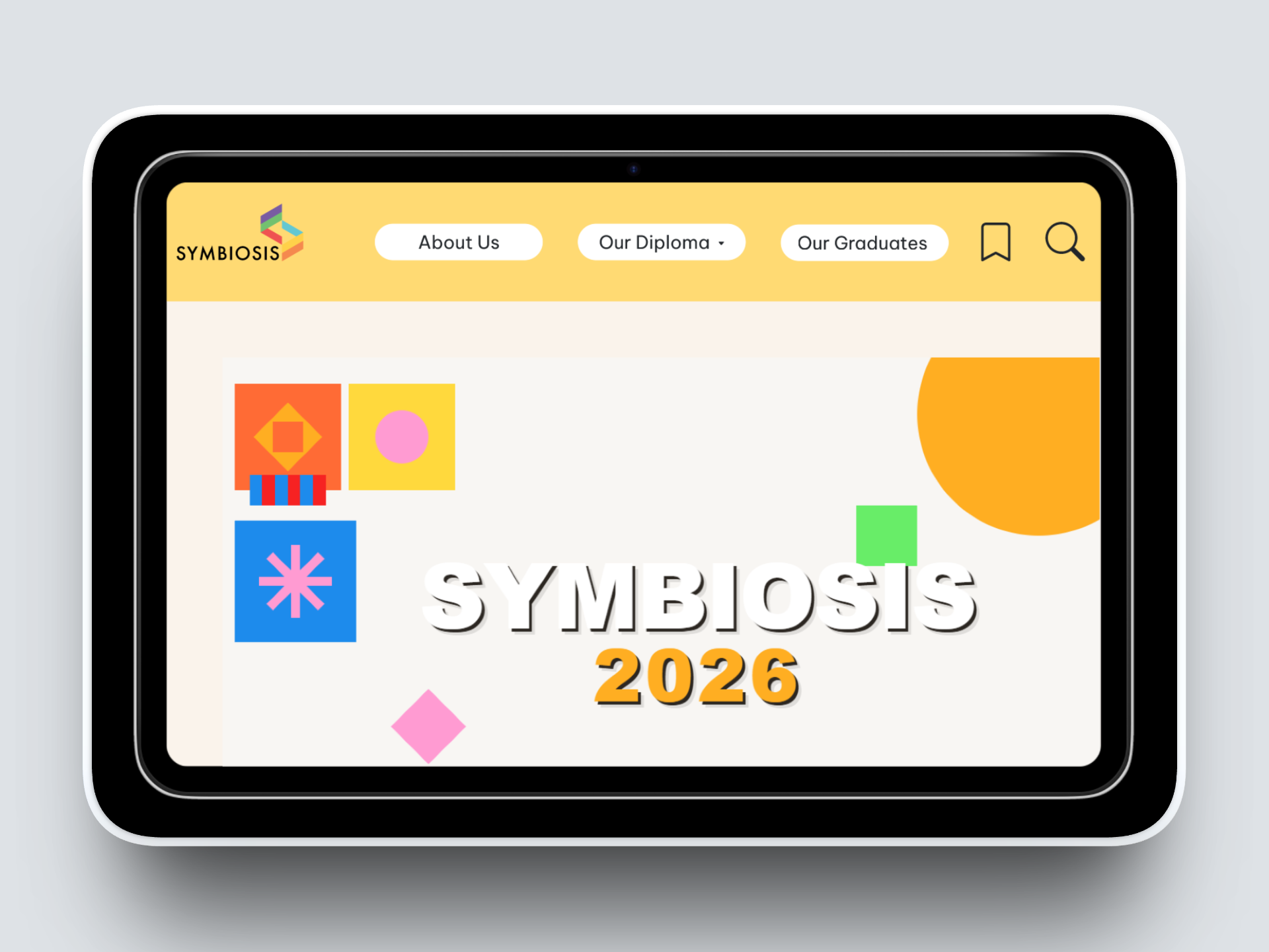
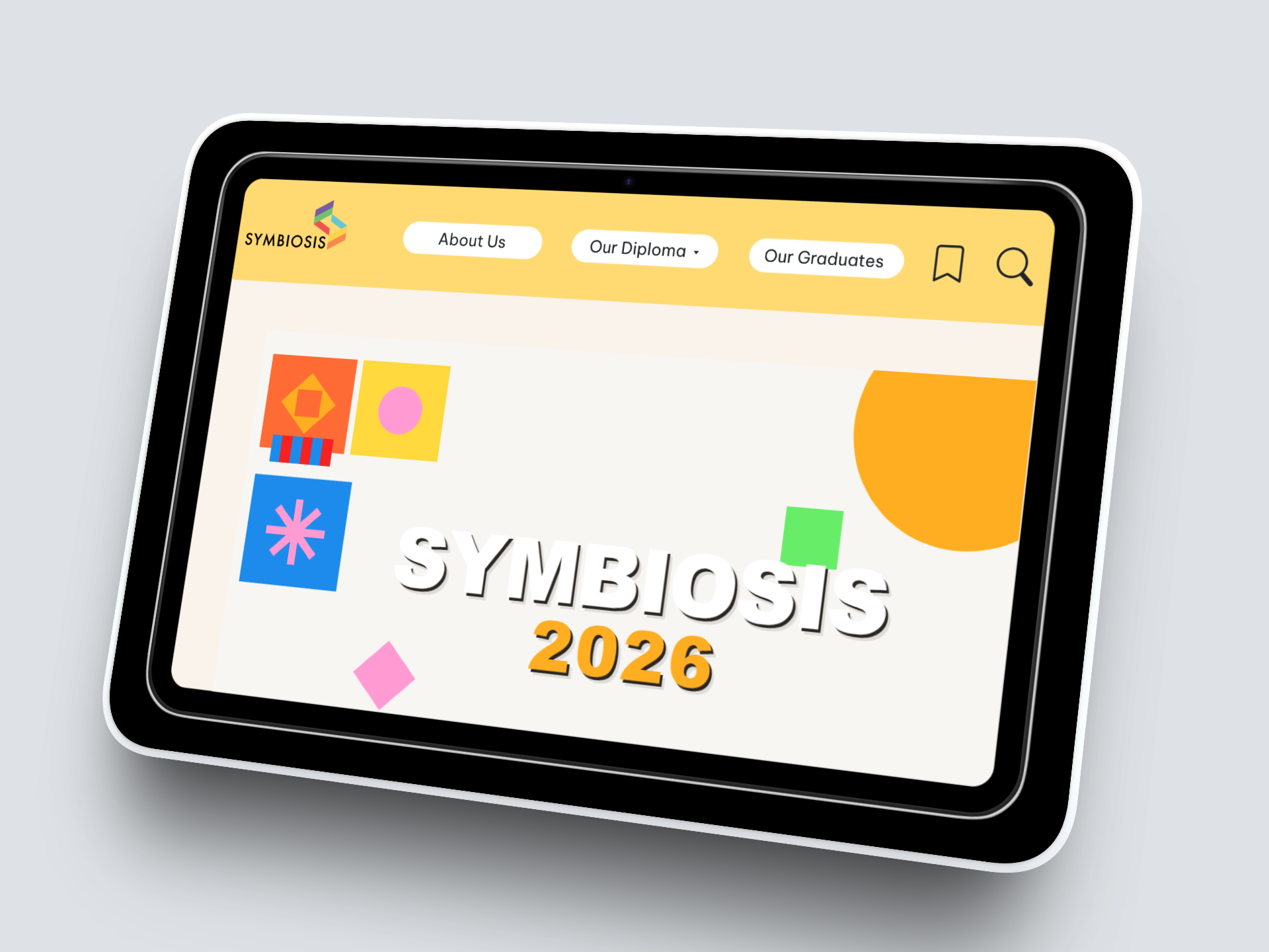
Final Year Project - Symbiosis 2026 Website Redesign
Project Overview
I contributed to the Symbiosis 2026 website, a platform highlighting STA graduates’ skills, projects, and portfolios. My role included research, design, prototyping, and coordination with developers and fellow graduates. Through this project, I gained hands-on experience in user-centered design, teamwork, and project management, while applying my skills in a real-world, collaborative environment.
How Desktop Research Was Conducted
The first stage of our design process was desktop research and analysis, where we reviewed past Symbiosis websites (2024 & 2025) to understand what worked well and what needed improvement. We compiled pros and cons of the 2 past websites using Miro, which allowed us to visually map feedback and identify patterns.
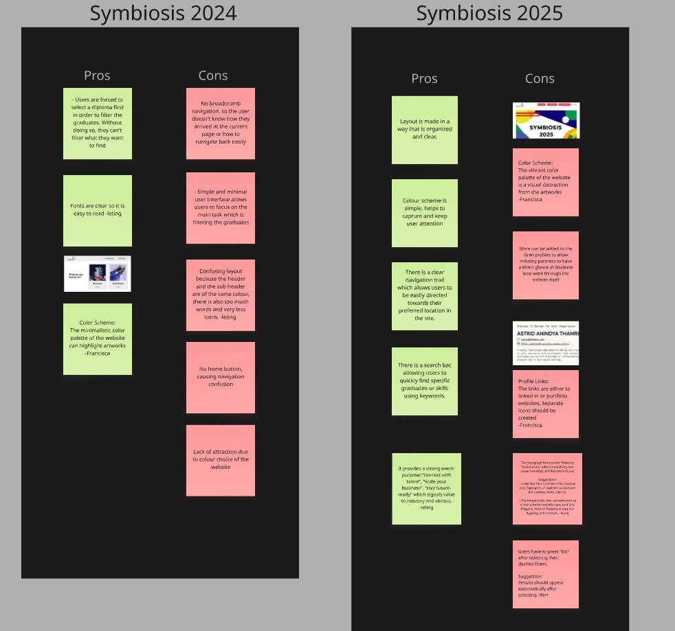
Desktop Research on different Symbiosis websites
Next, we created a sitemap and task flow of the previous websites to study user navigation and content structure. This helped us pinpoint areas where users experienced confusion or difficulty completing tasks.
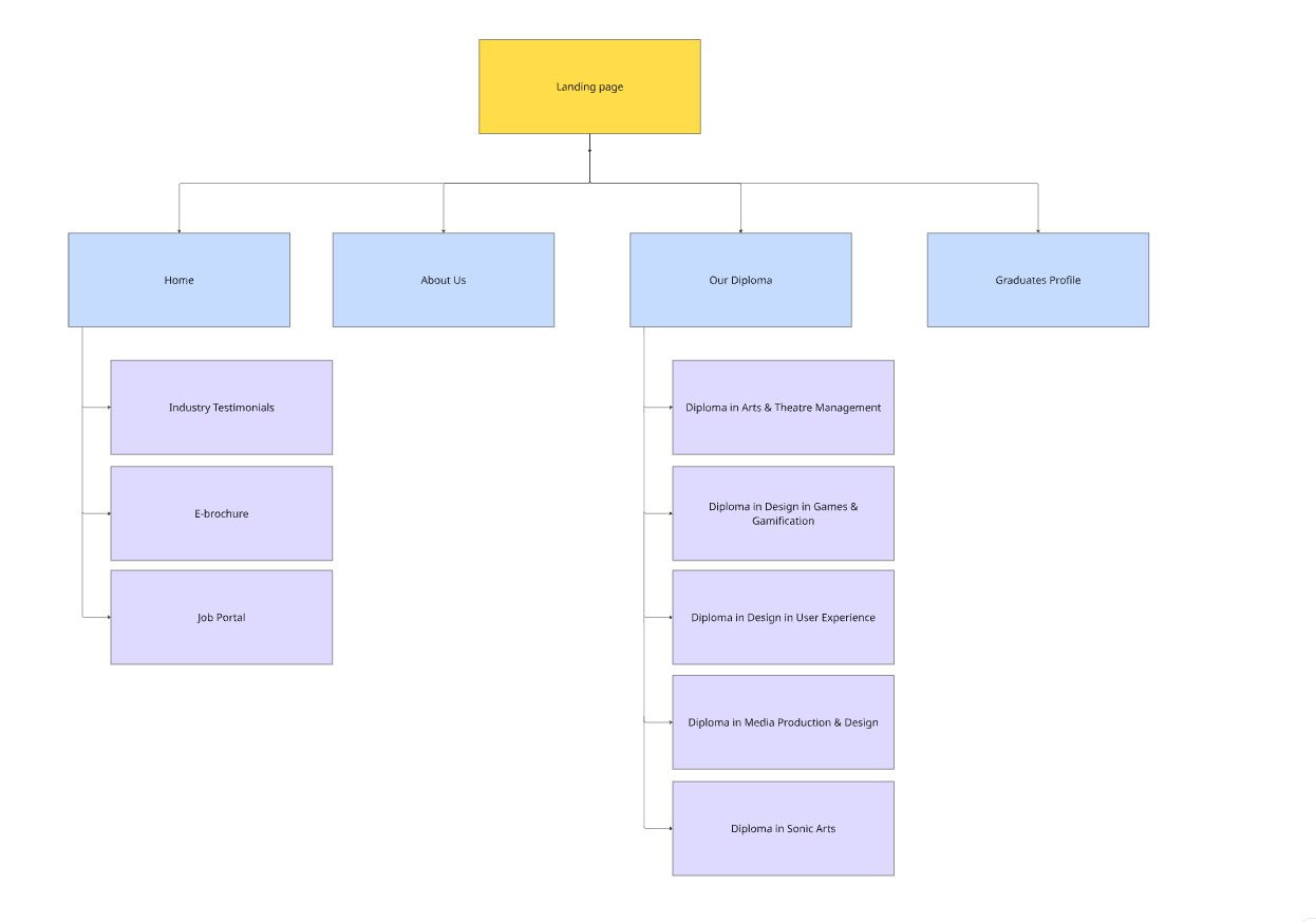
Sitemap of previous websites
We also conducted comparative research on other polytechnic graduation websites, noting best practices in UI, interactivity, and content presentation. This gave our team ideas for features, layout, and visual consistency for Symbiosis 2026.
Research on websites from other schools
Usability Testing & Pain Points
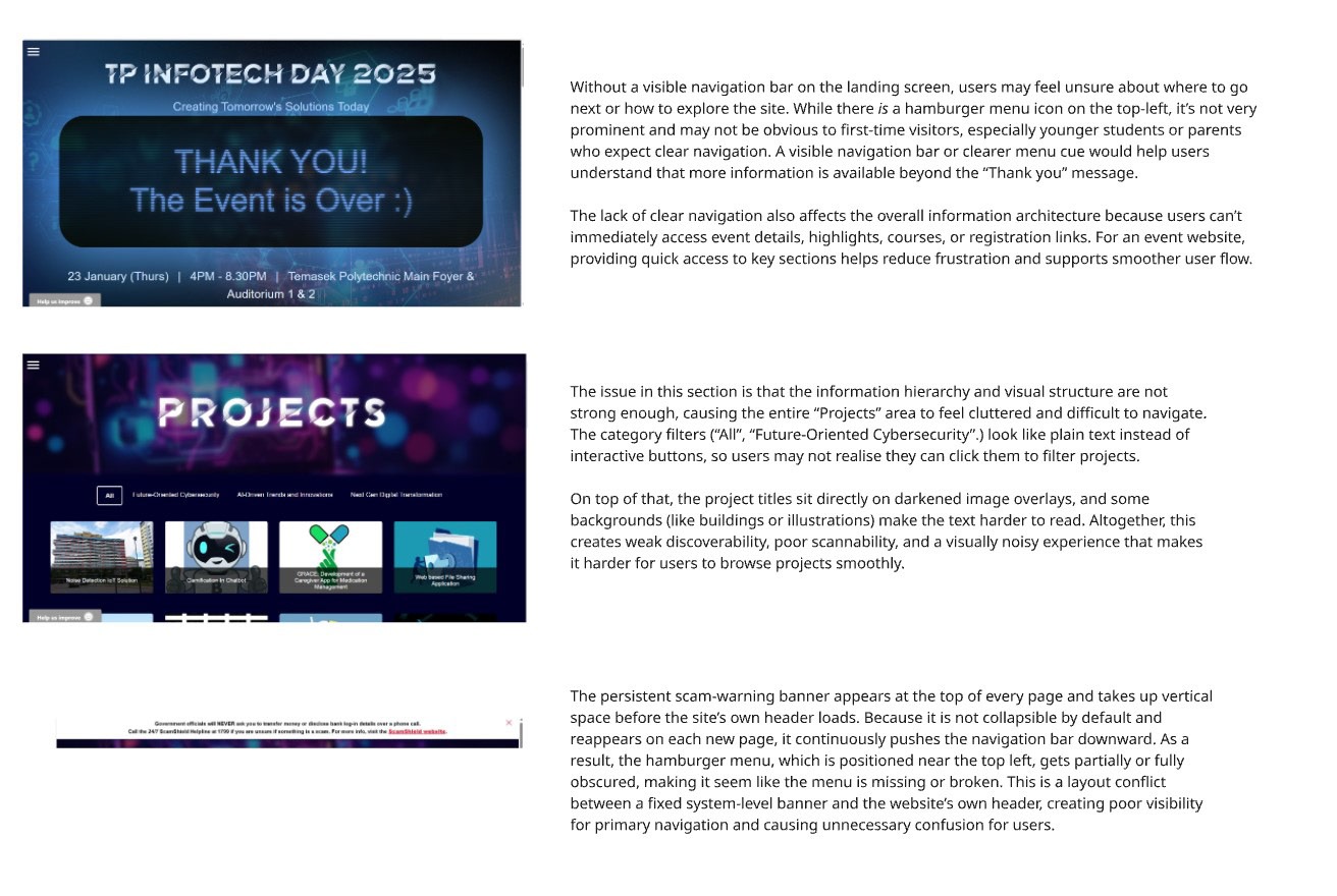
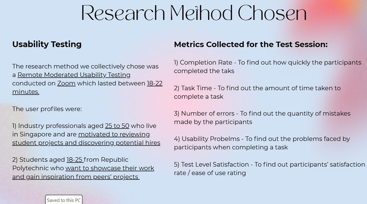
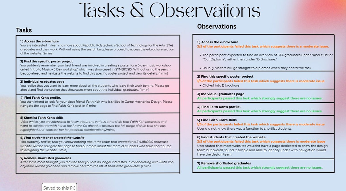
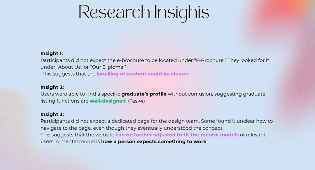
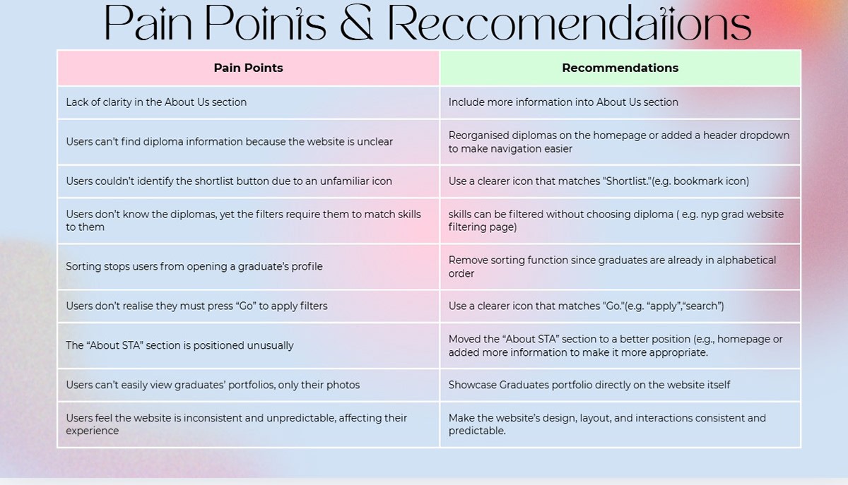
After completing the initial research, all of us conducted user research using usability testing to gather direct insights into how real users would interact with the Symbiosis 2026 website. We designed structured tasks and observation sessions with a Usability Test Plan, where participants were asked to complete key actions such as navigating graduate profiles, using filters, and exploring portfolios. By carefully observing their behavior, recording interactions, and noting any confusion or difficulties, we were able to identify research insights and recurring pain points, such as unclear navigation, difficulty in locating specific skills, and uncertainty in project prioritization.
Based on these findings, we then proposed recommendations to improve usability, including refining the information hierarchy, enhancing the filtering system, and emphasizing students’ top works, ensuring the final design was user-centered, intuitive, and aligned with both graduate and industry partner needs. This approach allowed the team to make evidence-based decisions that directly informed the next stages of ideation and design.
User Research Synthesis
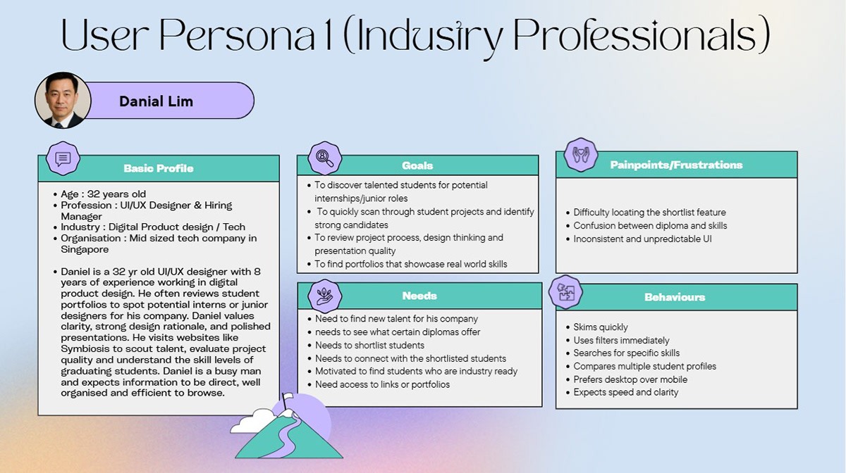
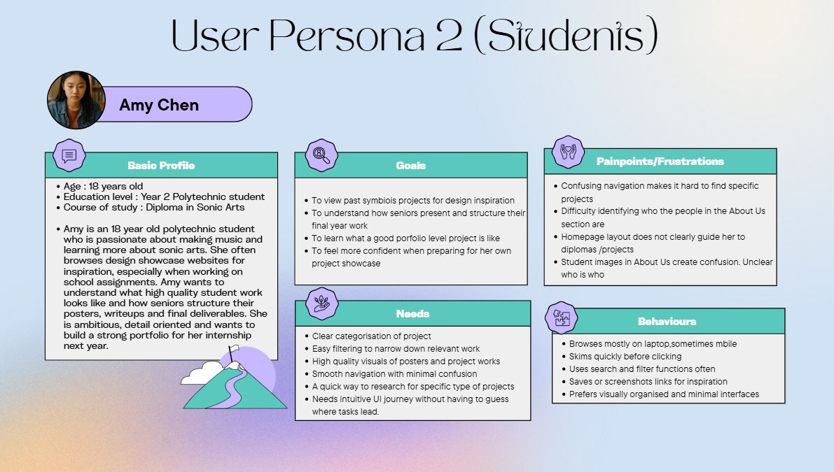
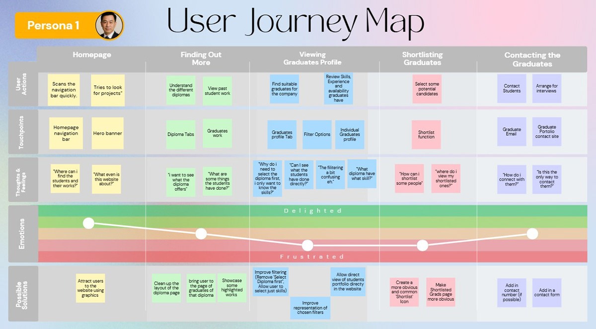
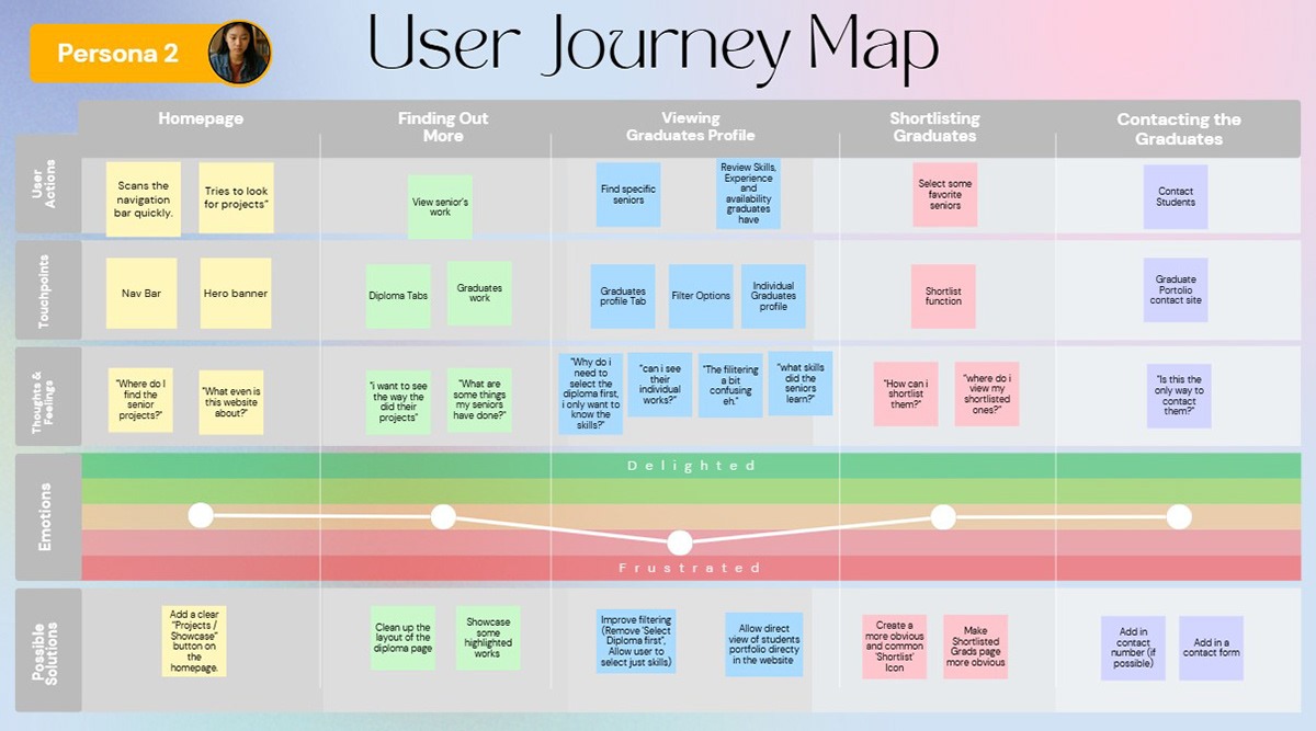
Following usability testing, I synthesized the research findings into actionable insights through user research synthesis. This stage involved creating two detailed user personas representing the primary audiences: one for graduating students and one for industry professionals. These personas captured each user’s goals, behaviors, motivations, and pain points, providing a clear reference for design decisions. Using these personas, my teammate then developed user journey maps that illustrated the step-by-step interactions each type of user would have with the website, highlighting key touchpoints, frustrations, and opportunities for improvement.
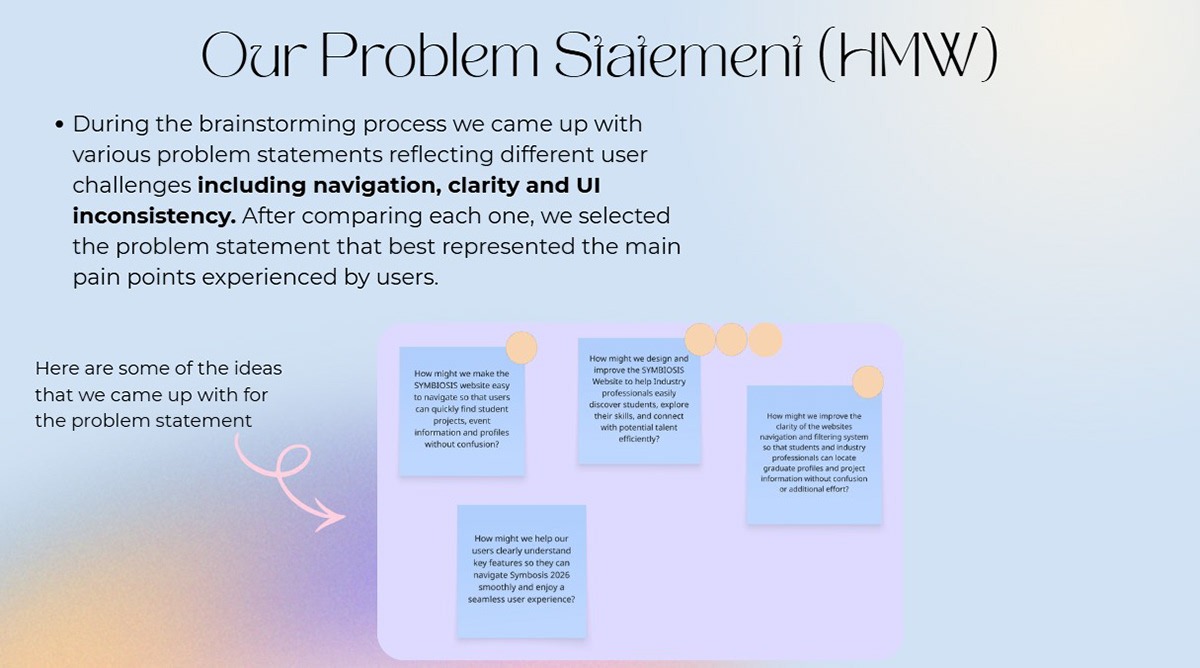
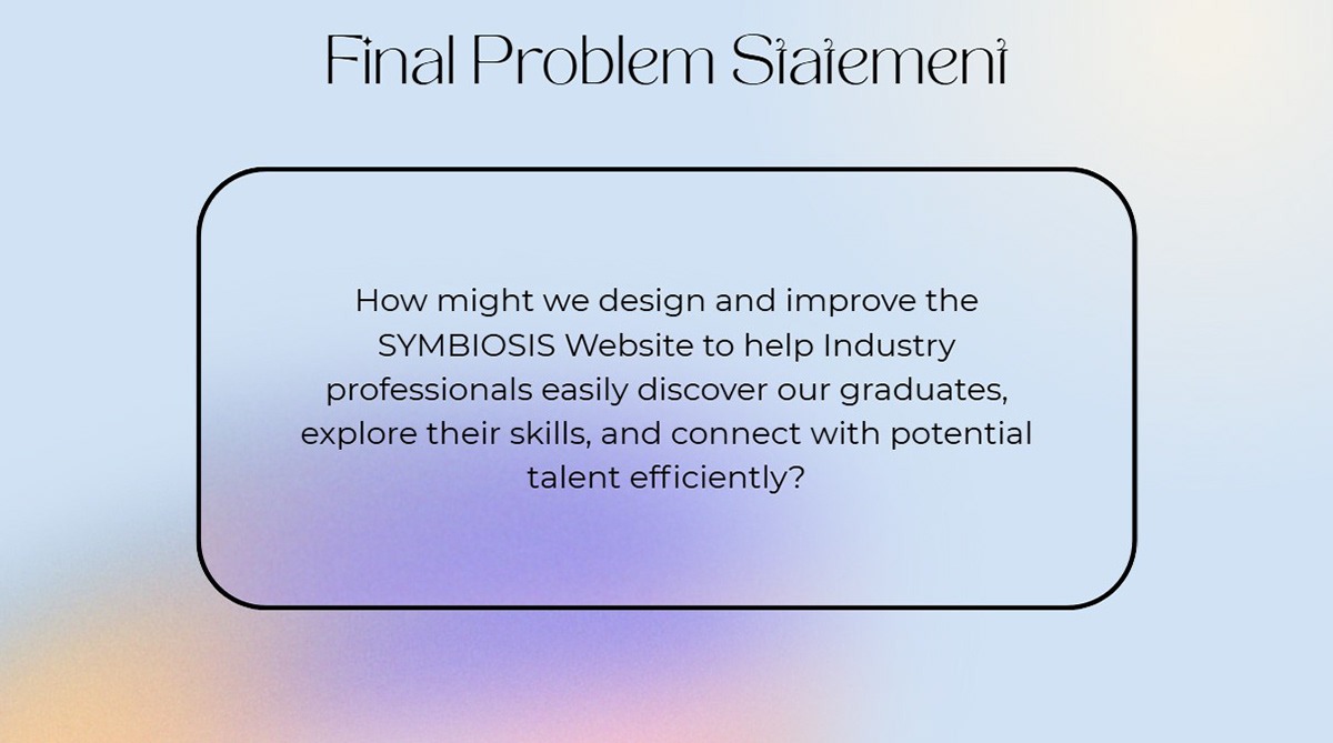
The team then conducted problem statement brainstorming, where we identified recurring challenges and gaps in the existing platform, such as difficulty navigating graduate profiles and unclear skill representation. From this, we formulated a final problem statement, which clearly defined the core design challenge: creating a professional, intuitive, and user-centered platform that allows graduates to showcase their skills effectively while enabling industry professionals to discover, evaluate, and connect with potential talent efficiently. This synthesis provided a solid foundation for the subsequent ideation and design stages.
Ideation Process
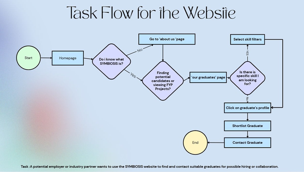
With the research insights and final problem statement as a foundation, we participated in the Ideation Process to conceptualize solutions for the Symbiosis 2026 website. The team first developed a task flow that mapped how users would navigate key features, ensuring a logical and intuitive journey from homepage to graduate profiles, filtering options, and portfolios.
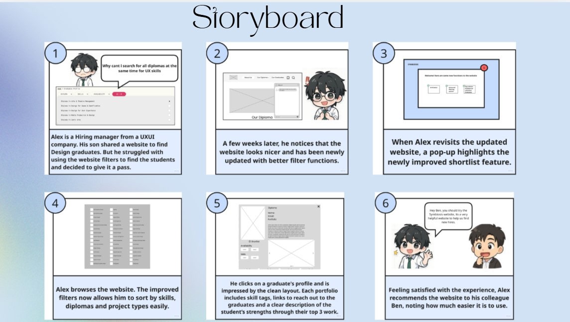
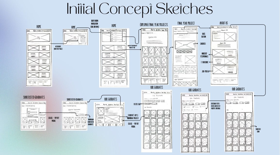
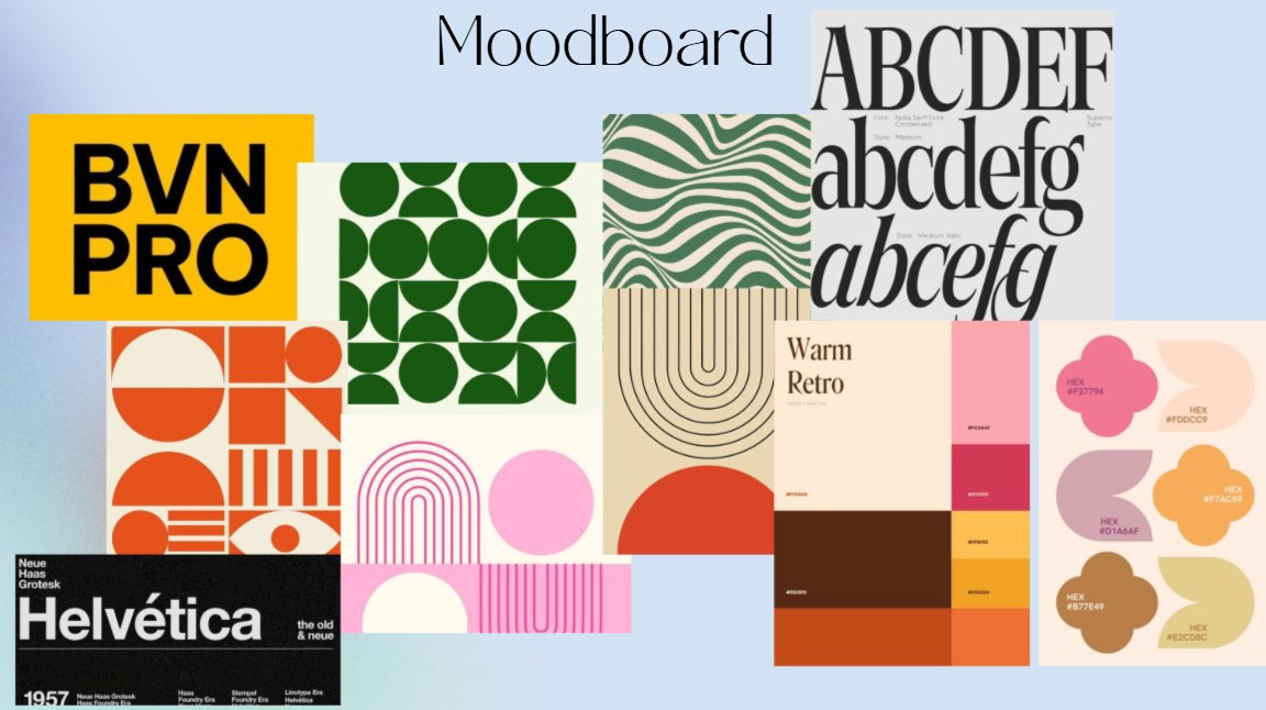
We then created storyboards to visualize typical user scenarios, illustrating how students and industry professionals would interact with the platform in real-world contexts. Next, my teammates contributed to wireframe sketches, which provided low-fidelity layouts showing the structure, placement of elements, and content hierarchy without distractions from color or typography. To define the visual and emotional direction, I also created a mood board, establishing the website’s aesthetic, including colors, typography, imagery, and overall style. This ideation stage helped align the team on design priorities, ensured all interactions were user-centered, and laid a clear roadmap for building high-fidelity prototypes.
Information Architecture & Low Fidelity Wireframes
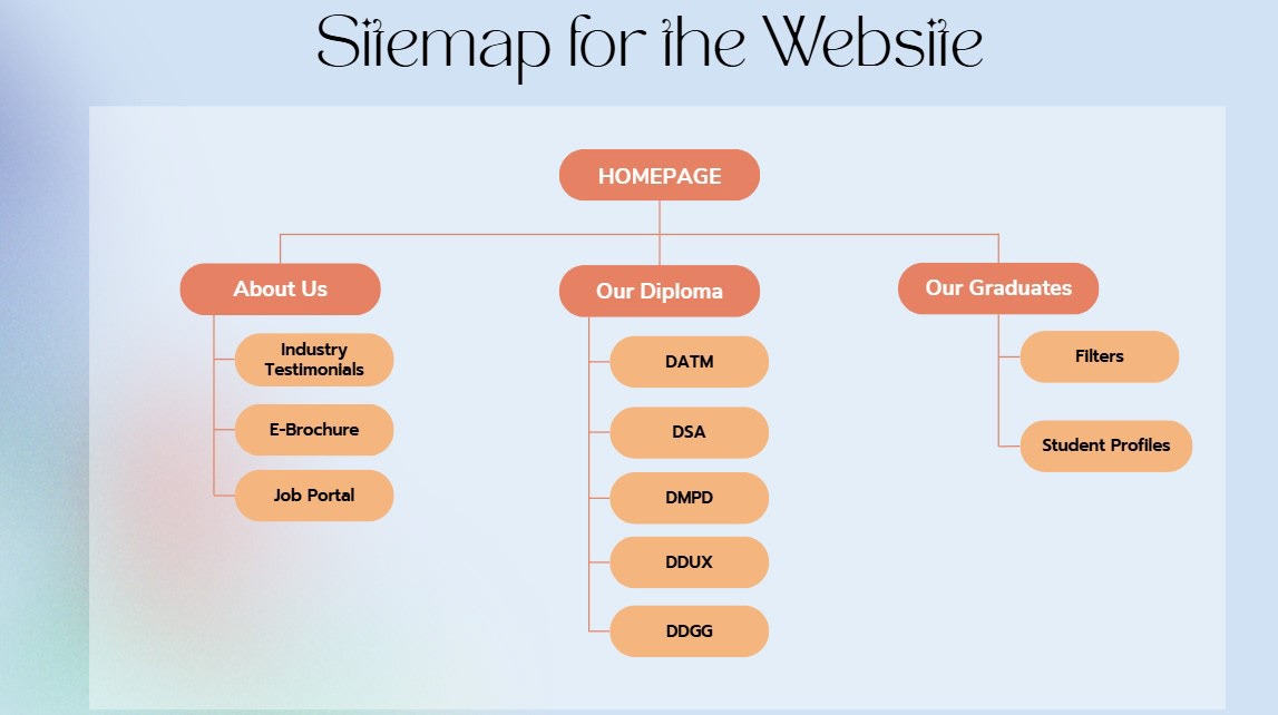
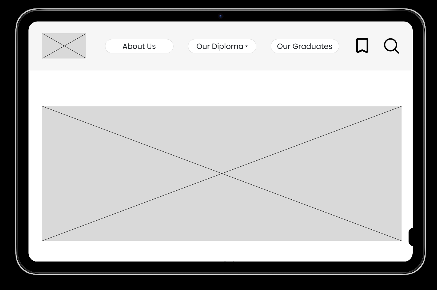
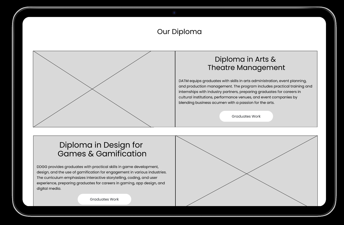
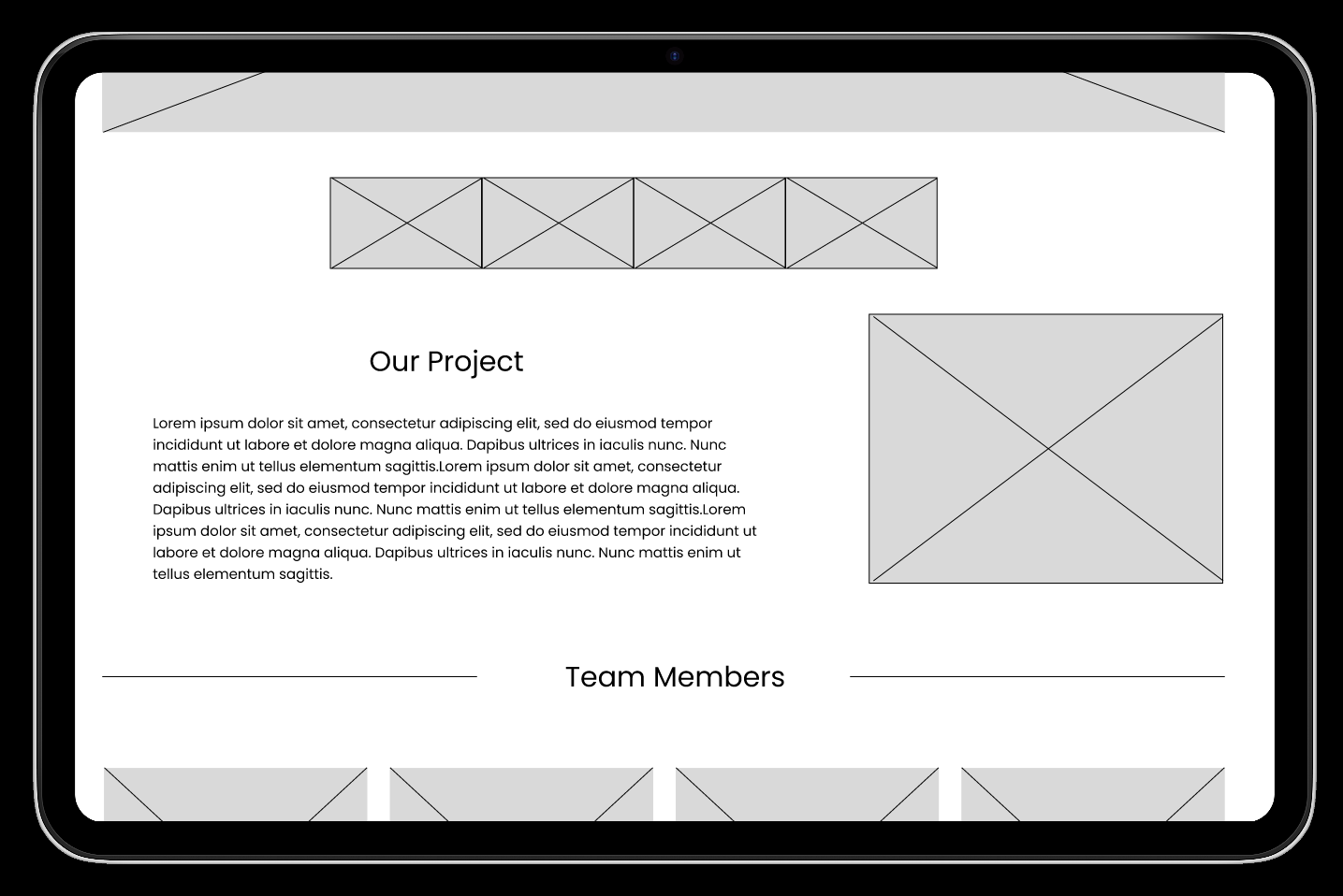
In the Information Architecture (IA) stage, we focused on structuring the content and layout of the Symbiosis 2026 website to ensure intuitive navigation and a clear hierarchy. I created a comprehensive sitemap that mapped all pages, including the homepage, graduate profiles, employer dashboard, and contact page, showing how users could seamlessly move between sections. Using this structure as a guide, my teammates helped to develop low-fidelity wireframes, which visualized page layouts, content placement, and key user interactions without distractions from colour or typography. These wireframes allowed the team to test navigation flows, identify potential usability issues early, and refine the layout before moving on to high-fidelity prototypes, ensuring that the website was both user-centered and functionally efficient.
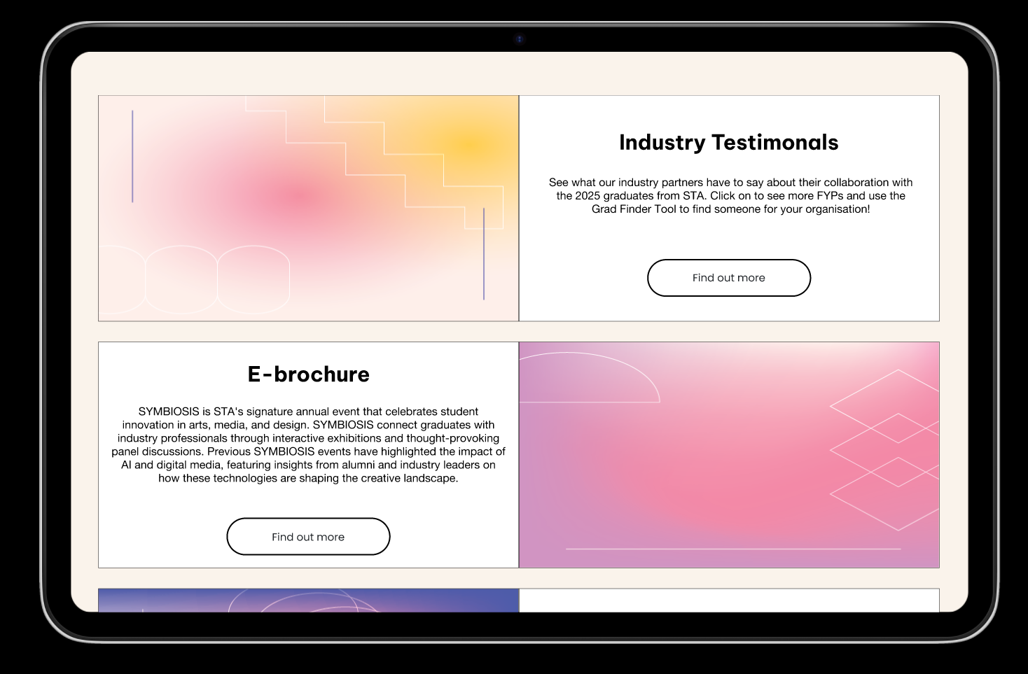
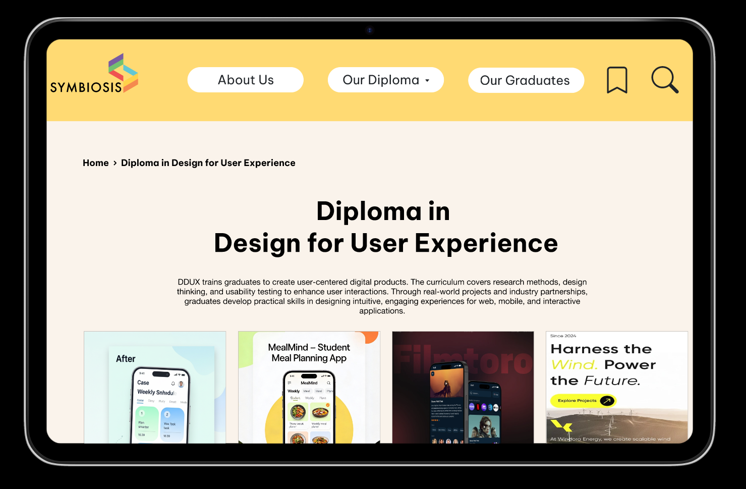
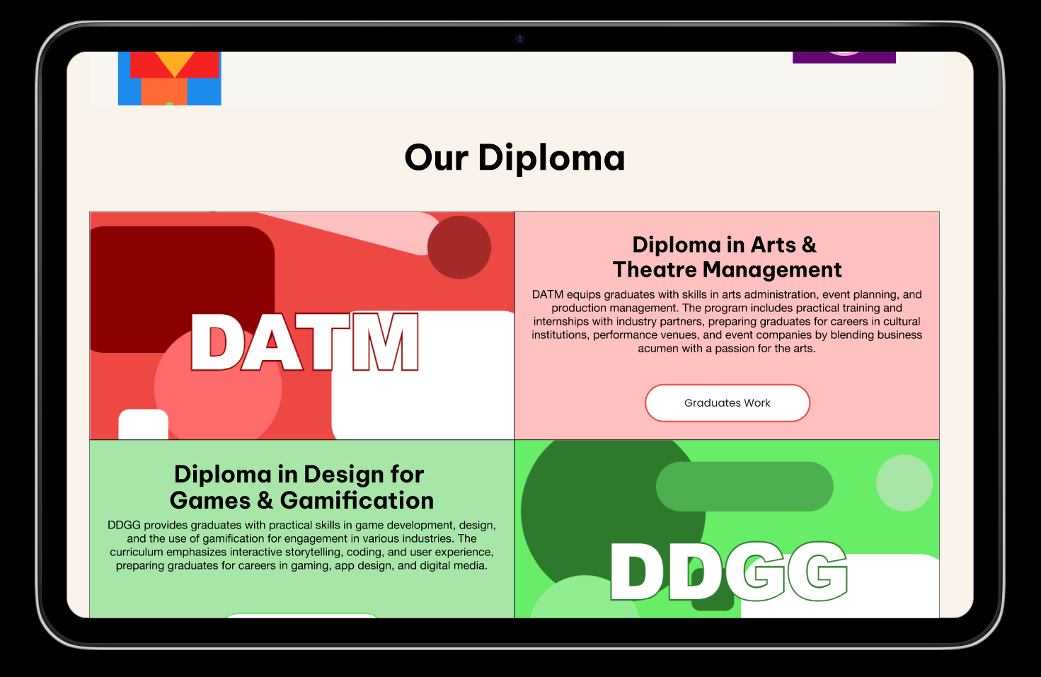
Design & Prototyping / Developer Handoff
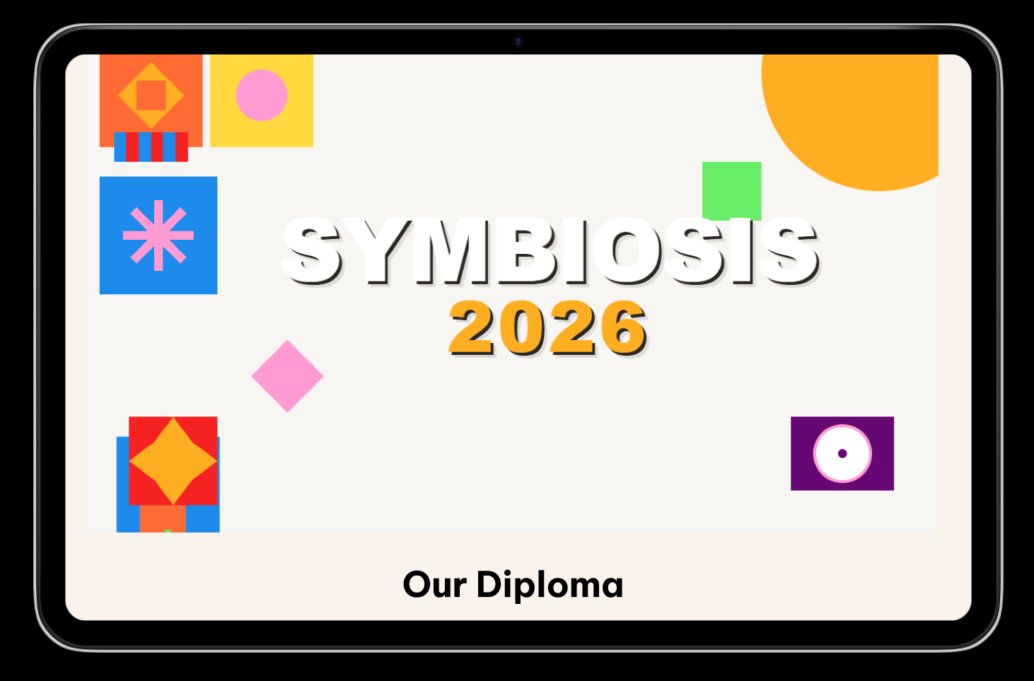
In the Design & Prototyping stage, I and another teammate transformed our low-fidelity wireframes into high-fidelity mockups on Figma, adding colors, typography, imagery, and interactive elements to reflect the final look and feel of the Symbiosis 2026 website. Once the mockups were ready, we presented the interactive prototype to the developers at PICO, walking them through user flows, key features, and design rationale. Based on their feedback, we refined the prototype, making adjustments to navigation, layout, and interactive components to ensure both usability and feasibility. After final improvements, we submitted the designs and coordinated with the developers for implementation, ensuring our vision was accurately translated into the working website.
A survey was created to take down graduates' availability dates
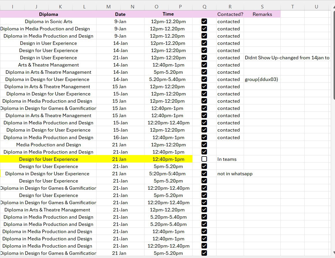
The availability dates were then noted down in an excel sheet
Photoshoot Logistics
In the Photoshoot stage, our team coordinated all logistics to capture graduates’ profiles and works efficiently. We first created an MS Form to allow students to select their preferred photoshoot dates. The responses were recorded in a centralized Excel sheet, which tracked timings and ensured no conflicts. To keep graduates informed, 2 of my teammates set up a WhatsApp group chat, providing reminders and updates. There was frequent back-and-forth communication between the graduates and me to accommodate rescheduling requests, ensuring that everyone had a fair and convenient slot while maintaining an organized photoshoot schedule. (names & phone numbers have been hidden deliberately to protect the privacy of graduates)
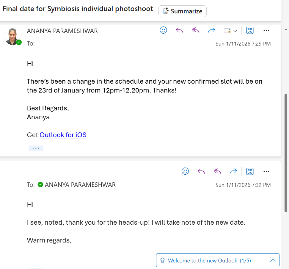
Constant communication between graduates, my team members & I
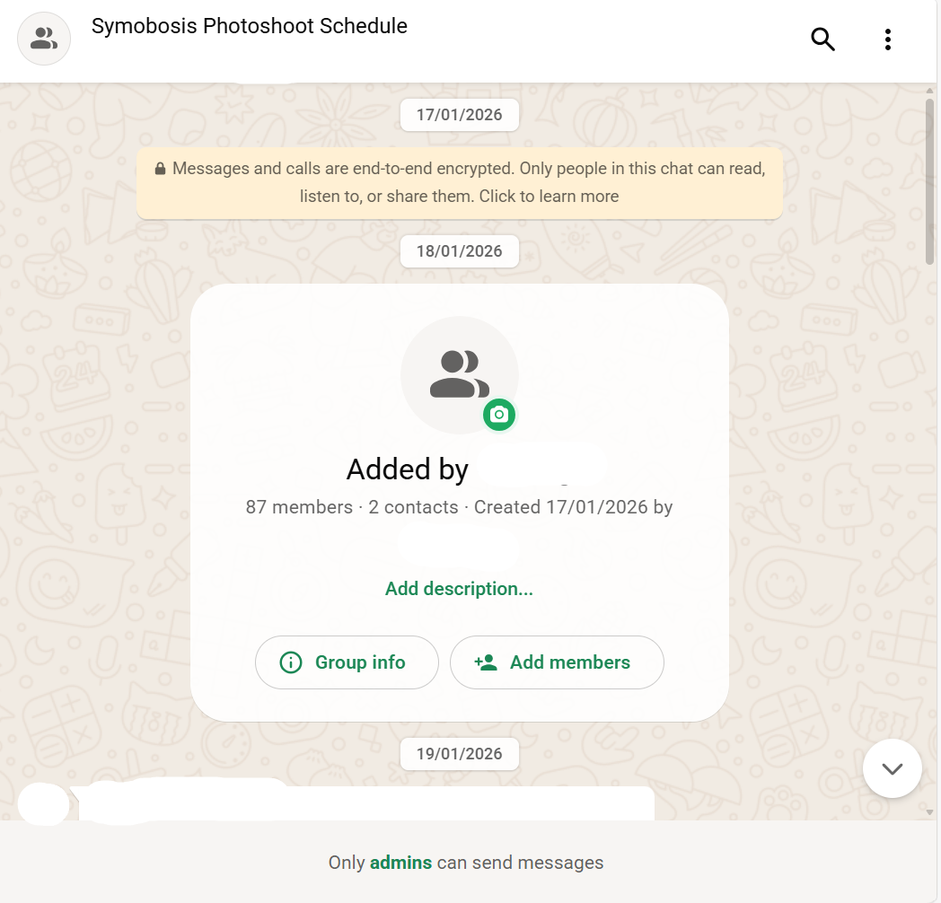
Communication was further enhanced by creating a WhatsApp group